
I redesigned ADDX’s brand and responsive investing experience so investors could understand and compare funds before signing up.
Preparing ADDX for global growth
ADDX was preparing to grow into a global brand, but its identity wasn’t yet mature enough to express the platform’s strengths. Its website was also difficult to use on a phone: desktop pages were cut off, sign-up came before any explanation, and fund details were hard to scan.
Over ten months, I led the redesign remotely from Taiwan, running regular design reviews and coordinating design delivery and engineering handoff with the Singapore team.
Before the redesign
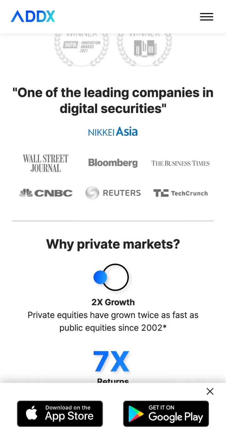
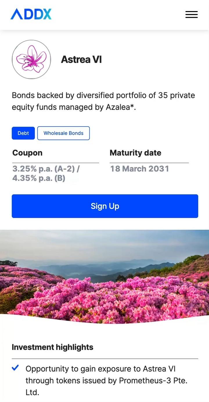
What wasn’t working
- 1Sign-up before substance. Sign Up buttons appeared before visitors understood what they were investing in.
- 2Details that blended together. Key fund terms sat in small grey tags and dense text, so offerings were hard to tell apart.
- 3A pitch instead of context. Awards and press coverage led the page, instead of explaining private markets to investors who were new to them.
Making a distinctive brand strength visible
A 2021 review of 20 investment platforms surfaced an opportunity for ADDX: make blockchain part of a more credible, distinctive investment brand. Rather than hide the technology, the redesign explained what blockchain made possible for investors throughout the website, from lower minimums to secure, regulated access.
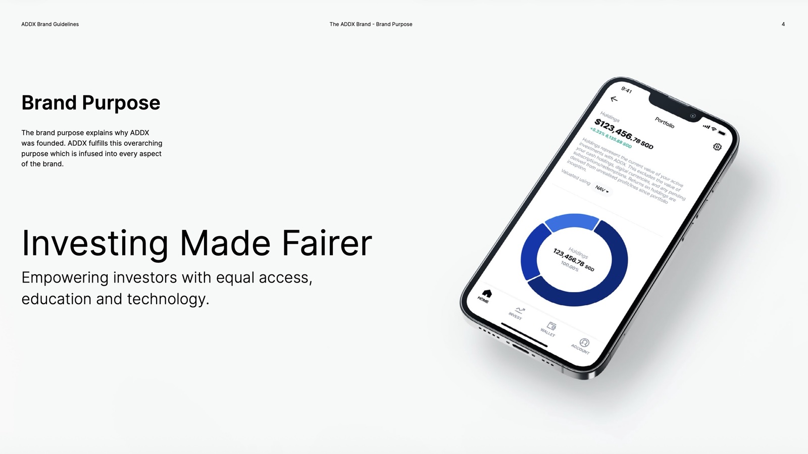
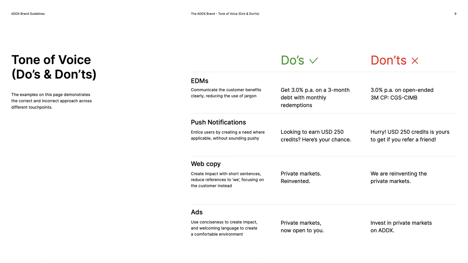
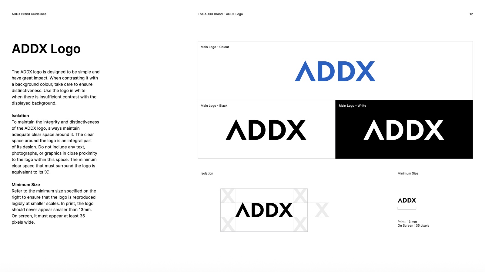
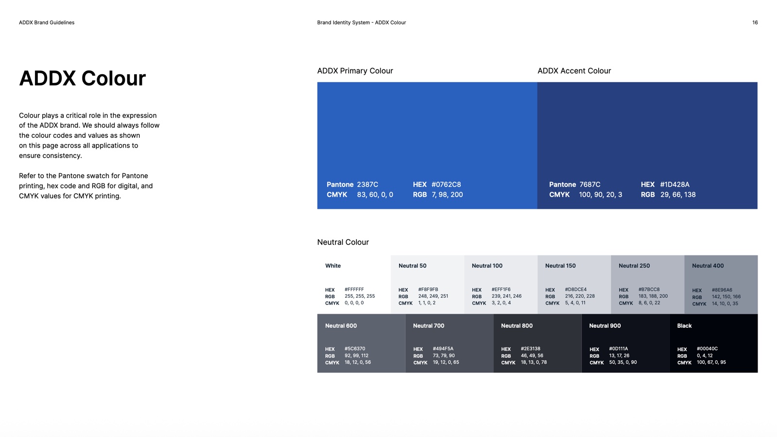
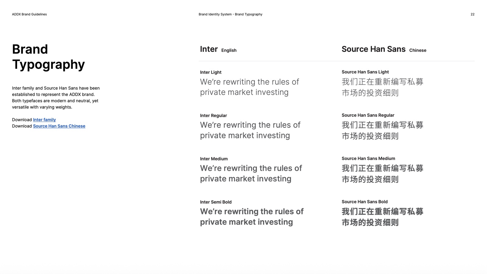
ADDX’s graphics, imagery, illustration, and colors had become inconsistent since its 2021 launch. I created brand guidelines for personality, visual language, and tone of voice, giving the team a shared foundation for the redesign.
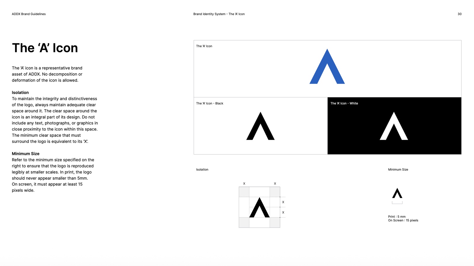
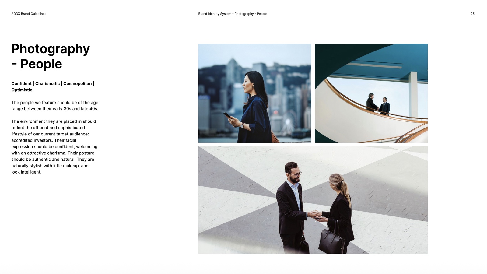
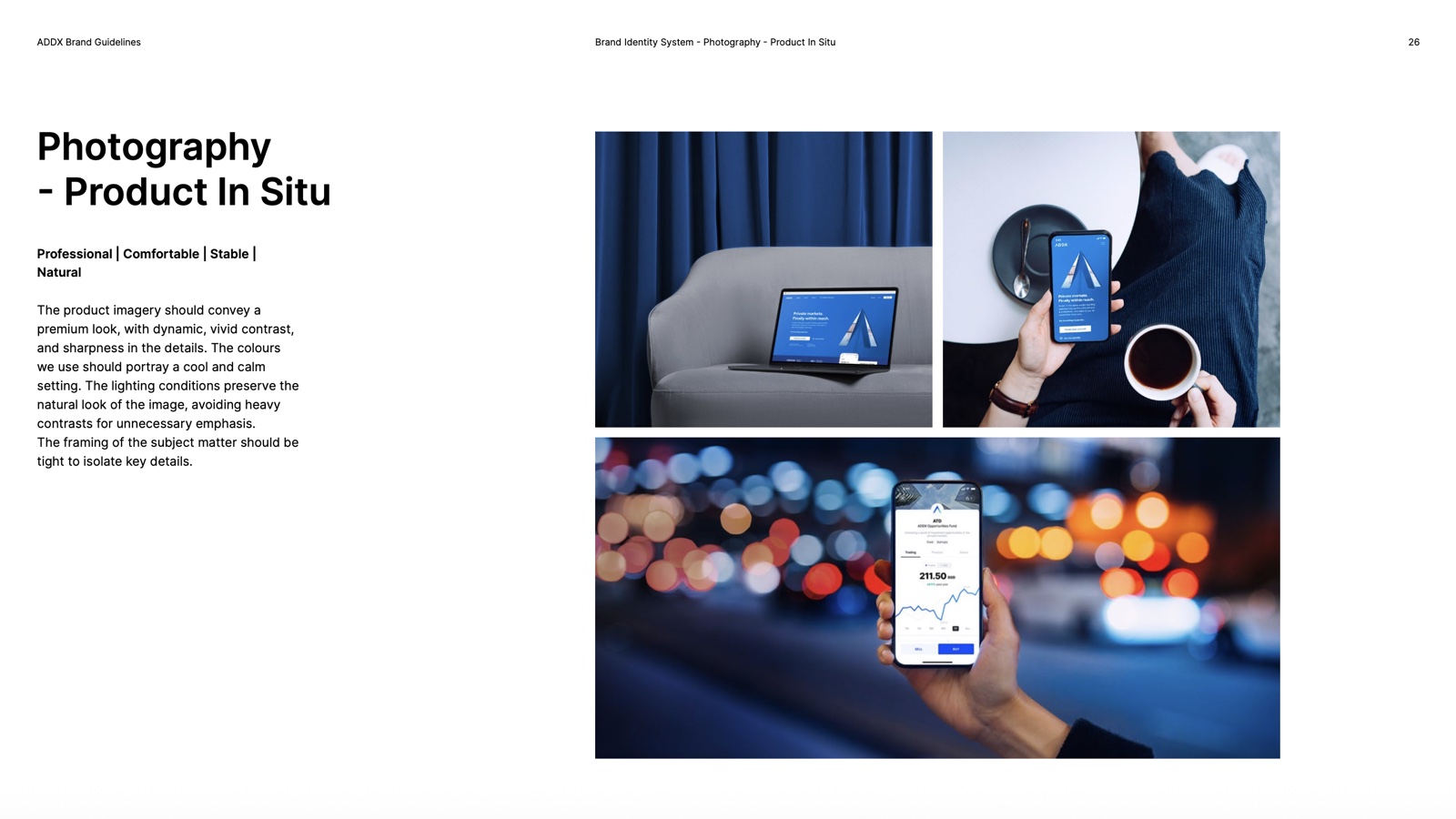
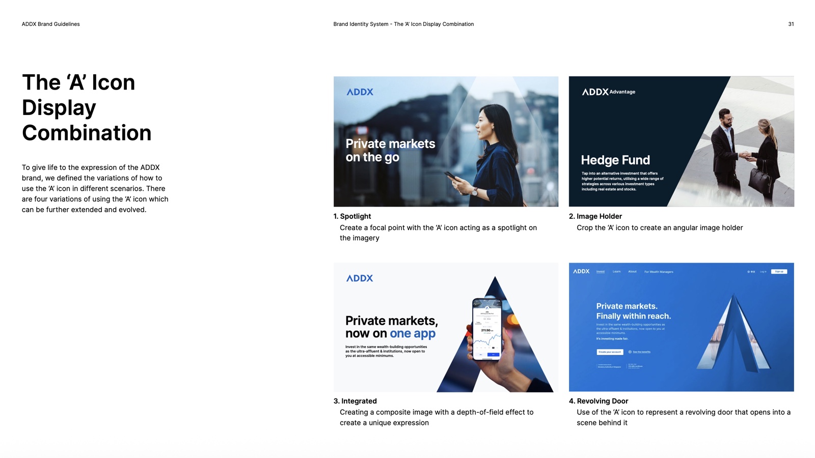
To carry the brand into the product, I designed an outline icon set built on four key shapes, so every icon shares the same structure and stroke weight.
Taking the brand into the world
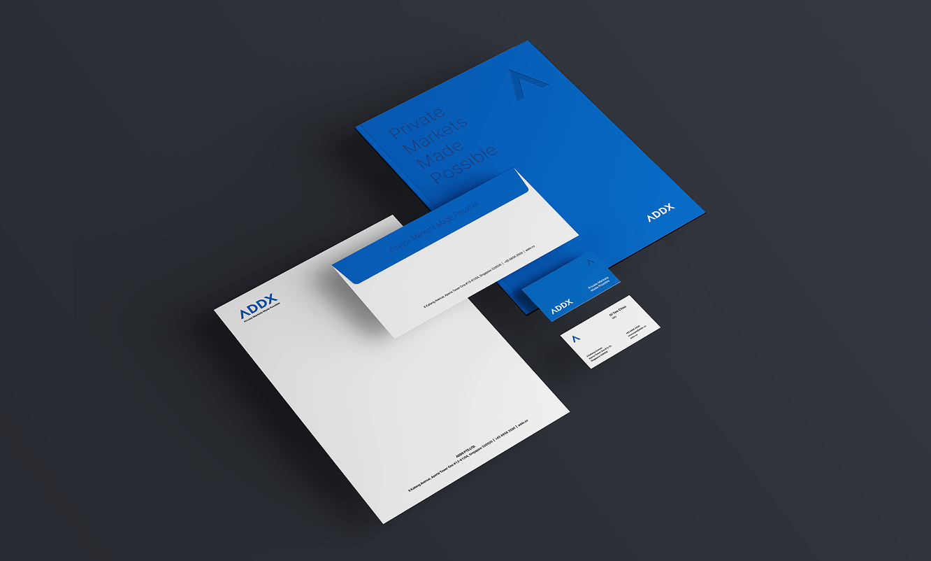
I carried the new identity beyond the website, from campaign billboards and event flags to email, stationery, and branded merchandise.
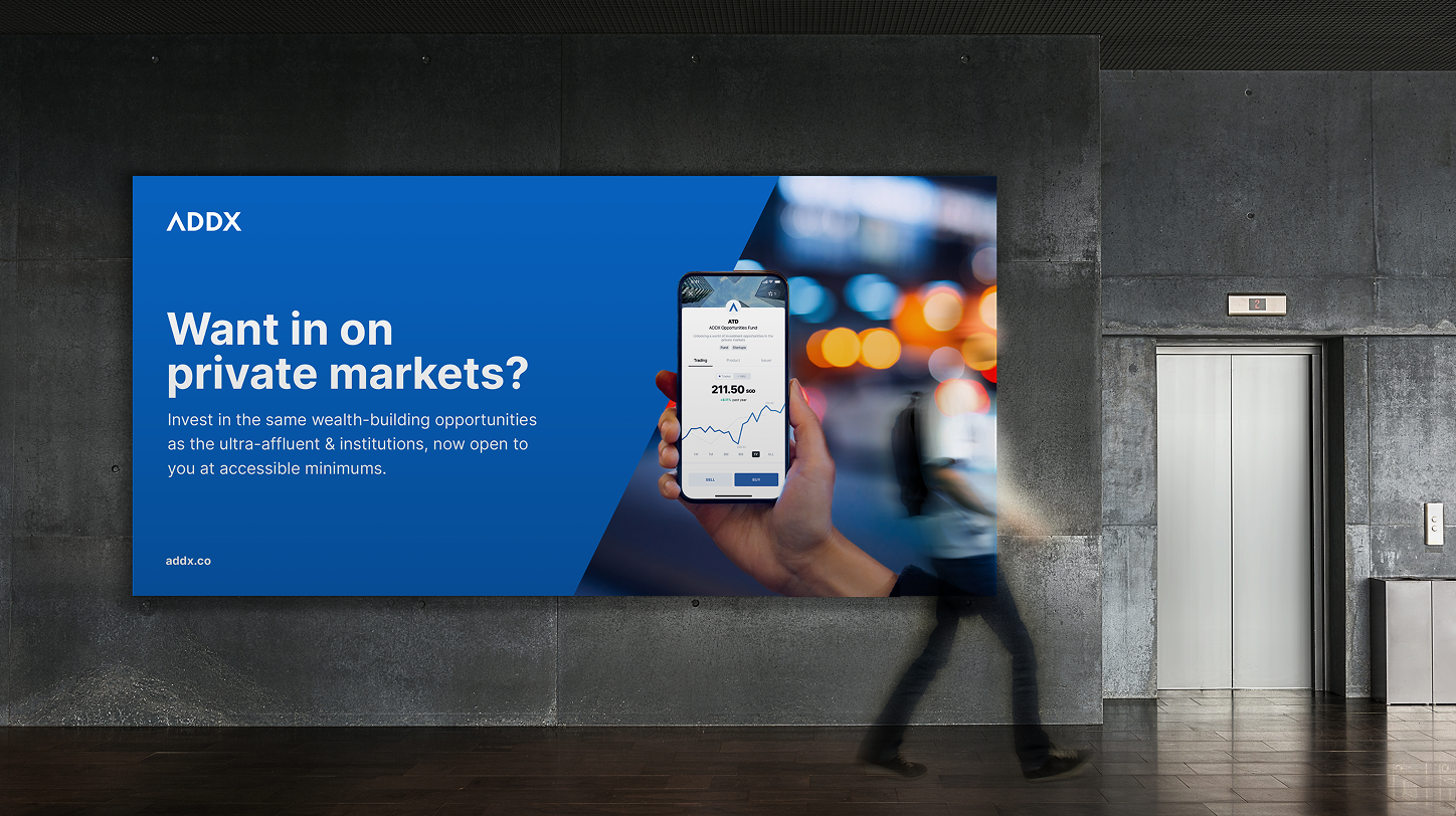
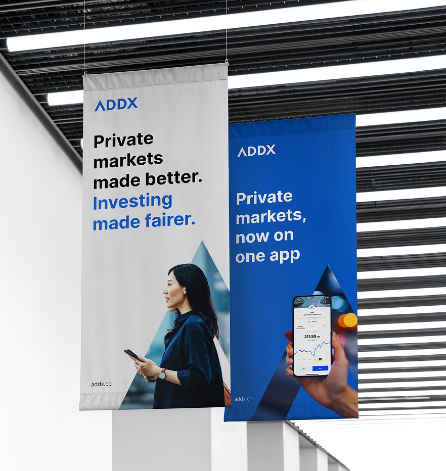
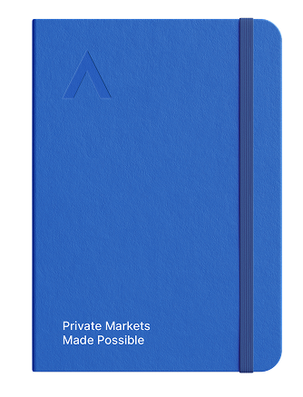
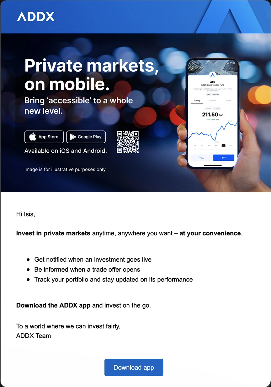
Investors needed context before a pitch
Surveys, interviews, and industry reports showed that accredited investors in their 30s and 40s valued credible sources and market trends when assessing opportunities. They were experienced in public markets, but less familiar with private markets.
The old homepage led with a pitch for ADDX. I shifted the order to explain the market and surface the platform’s strengths before asking visitors to explore investment opportunities.
Make the experience easier to understand and explore
Lead with evidence
I reshaped the homepage to open with market trends and how private markets have performed, then surface top-tier funds, so investors new to private markets could see the case before being asked to sign up.
Make navigation easier to scan
The old navigation mixed menu patterns. I standardized it around one dropdown style and added a short explanation to each item.
Make funds easier to compare
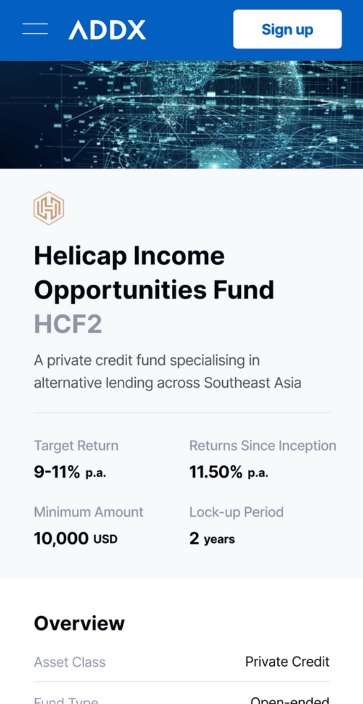
The investment page listed funds without search or filters, while key details were buried in small print or greyed-out tags. The offerings looked too similar to scan.
I added sort and filters, brought key details forward, and used fund logos to make listings easier to recognize and compare.
Show enough before sign-up
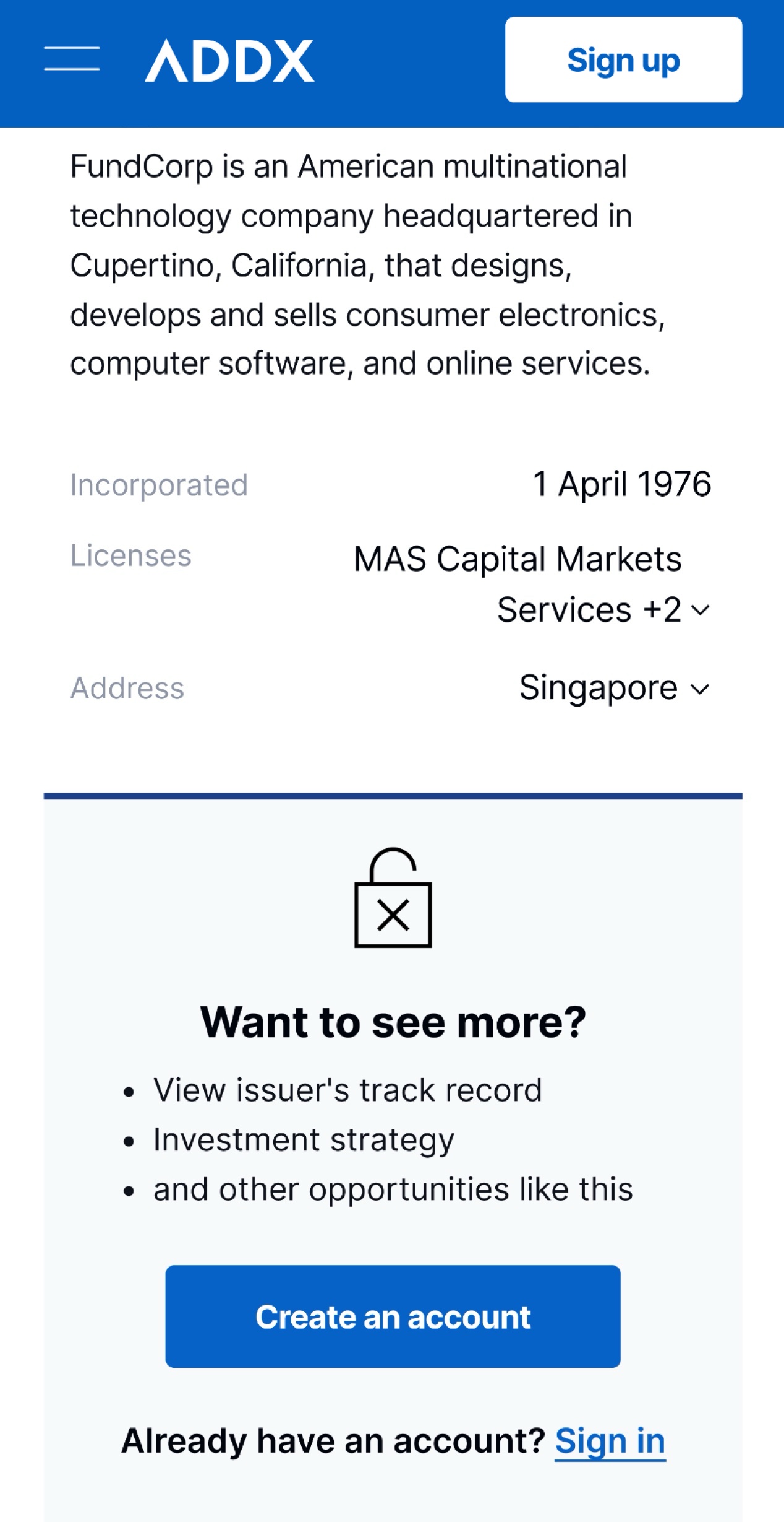
On the old site, visitors met a Sign Up button before seeing what they were investing in. The redesigned fund page showed key terms and an overview to everyone, and kept confidential details, such as the issuer’s track record and investment strategy, for registered users. Visitors could judge an offering first, and signing up became the way to see more, not a wall.
Extend the brand to institutional investors
For ADDX Advantage, which serves institutional investors and wealth managers, I adjusted photography and colors for a more composed B2B feel while keeping it within the ADDX brand system.
Building ADDX for a global audience
Both the redesigned ADDX website and the ADDX Advantage site launched, giving ADDX its first responsive website and one consistent brand story from the homepage to individual fund pages. Teams across the company also adopted the brand guidelines in their everyday work, so the new identity carried beyond the website into campaigns and events.