


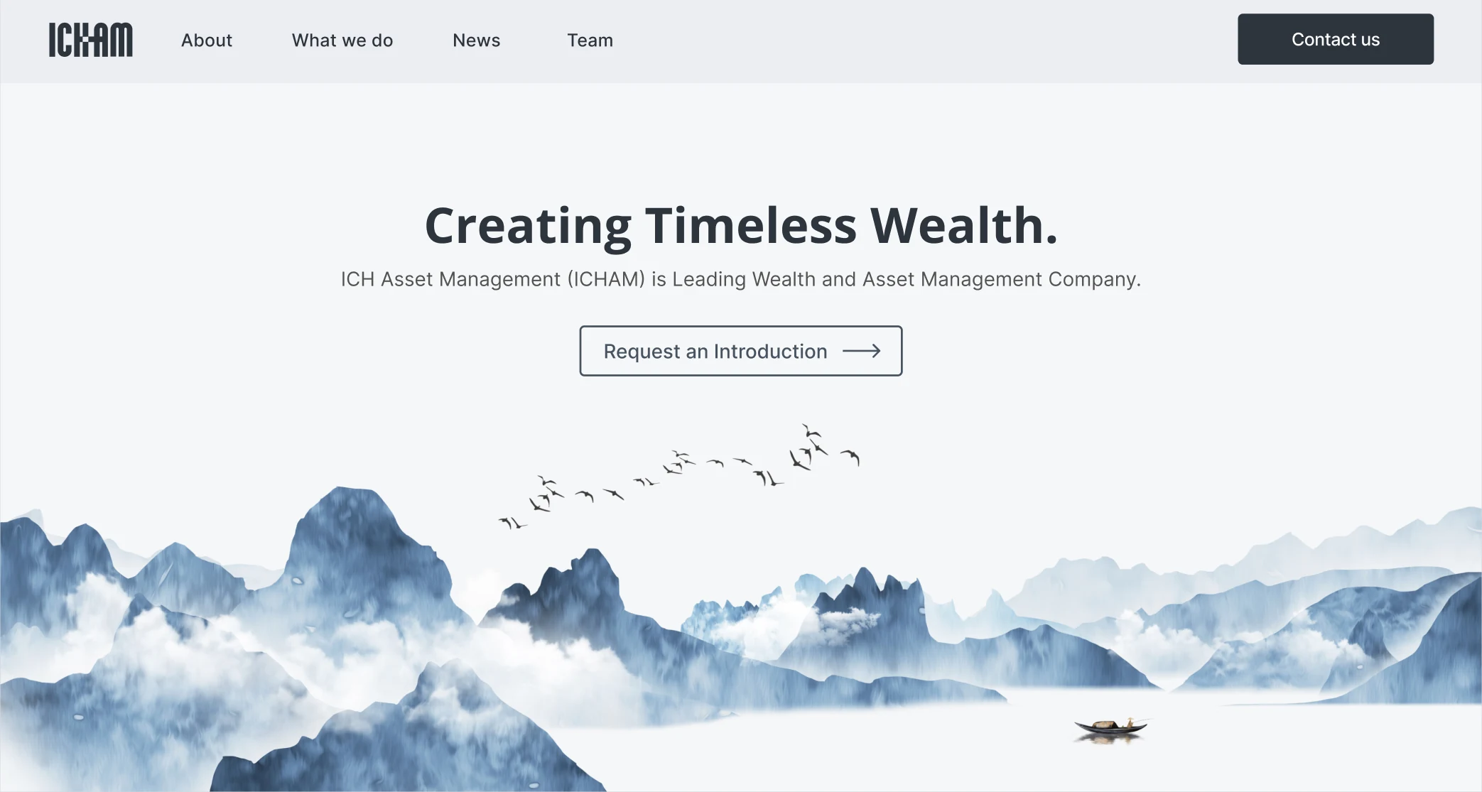

I researched what made potential clients doubt the old site, proposed a redesign, brought in a developer, and led the project through launch.
A first impression that raised doubts
ICHAM is a Singapore-based multi-family office that manages wealth for private clients and institutions across Asia. Its website was often the first introduction to the firm.
But the old site looked generic. Four of the five people we interviewed questioned whether the firm looked professional or reliable. One described it as “a stock WordPress website” and added, “I can’t tell it’s real unless I click into the team members.”
If visitors couldn’t tell whether ICHAM was real, they had little reason to trust it with their wealth.
Before the redesign
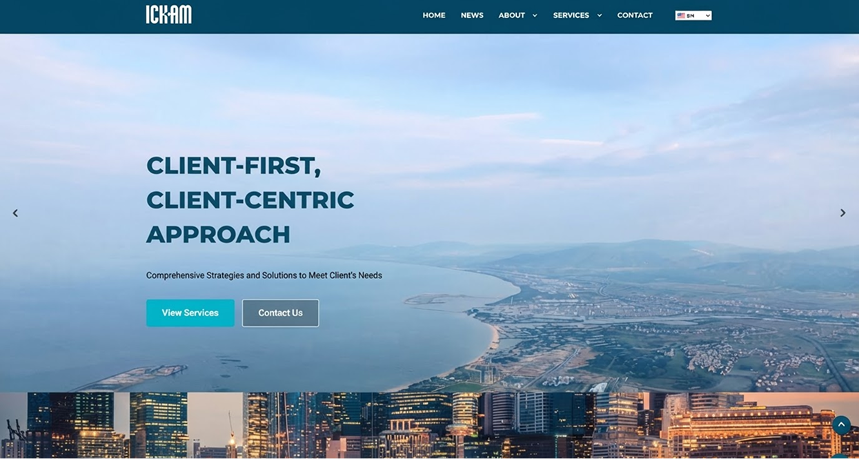
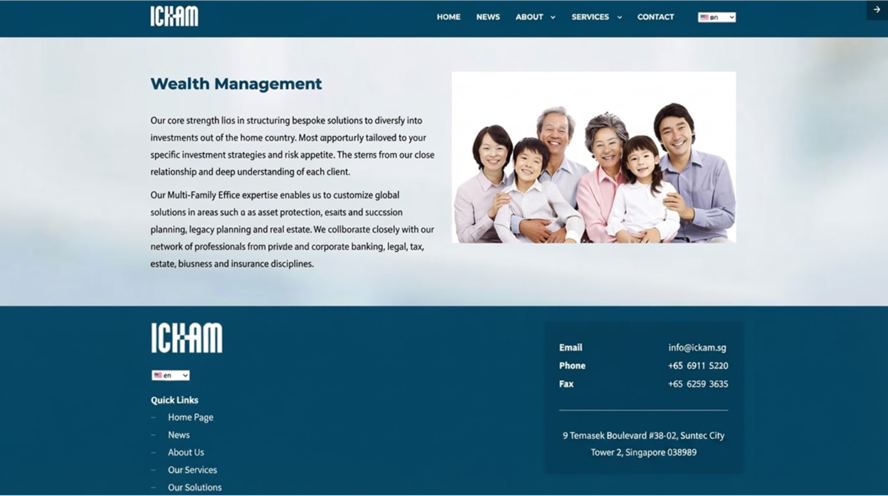
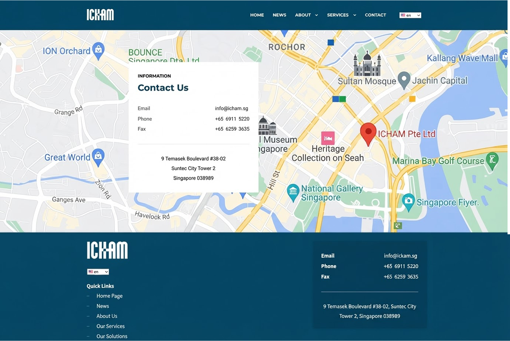
Unclear offer. “Client-first, client-centric approach” didn’t say what ICHAM did.
Research pointed to a clearer, more personal experience
I reviewed five family offices and wealth managers. The stronger sites made the team easy to see and contact easy to find. The weaker ones were wordy or looked inconsistent. I also interviewed potential clients, who are private and hard to schedule, so I reached them through financial advisors. They wanted to know what ICHAM actually offered, and how to reach someone.
That gave the redesign a clear direction: less text, a stronger visual identity, and a more direct path to contact.
A visual identity built around “Creating Timeless Wealth”
The CEO described ICHAM as modern, young, talented, and tailor-made. To move beyond the old site’s generic look, I chose a restrained ink-wash direction, pairing three commissioned illustrations with landscape imagery to create a calm, distinctive identity around “Creating Timeless Wealth.”
Carry the visual identity into the newsroom
I carried the same ink-wash language into the newsroom. Six commissioned illustrations give each press story its own visual anchor and make the news grid feel like part of the homepage.
Make it easier to start a conversation
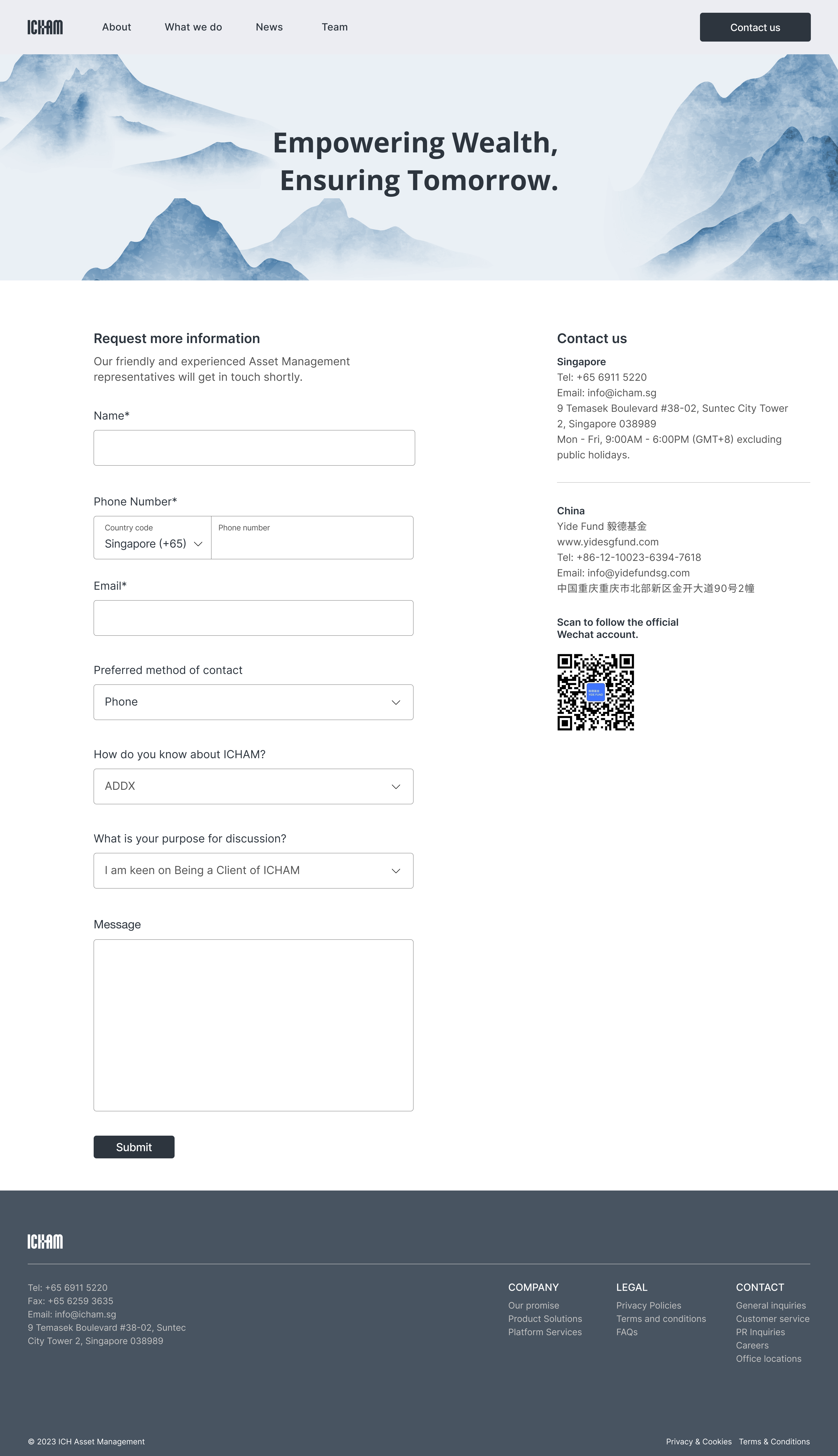
The old contact page listed only an address and phone number, with no easy way to start a conversation. I redesigned it around an enquiry form and several contact options, including WhatsApp. The form also screens enquiries with a few questions up front, so ICHAM knows who it is talking to before the first call.
Testing led to two practical changes
In task testing, four of five participants found the brochure easy to download. One raised a concern: anyone could enter a fake email to get it. I changed the flow to send the brochure by email instead, so the leads ICHAM collects come with real contact details. Two participants also wanted easier navigation, so I made the top bar stay visible while scrolling.
From a self-initiated proposal to launch
I proposed the redesign on my own. After the client approved it and asked to move ahead, I brought in a developer and led the project from research through launch.
“Really impressed! Love it! I agree with the users; the website is elegant and neat. It's a success.”
30+
qualified leads reported in the first months after launch
The firm was also named Fund Manager winner at The WealthBriefingAsia Awards 2025.