QUEEN
Turning a 22-year TV brand
into a digital revenue engine.
I built the infrastructure a TV-first organization was missing, aligned teams around it, and used it to create new digital revenue.
- Role
- Sole Product Designer
- Year
- 2024–2026
- Scope
- Design System · Product · AI
- Platform
- Web + App
A top TV brand with no digital business
After 22 years on air, Queen had grown into one of Taiwan’s top three women’s lifestyle IPs by Comscore. Its website and app extended the show online, mostly through articles and clips; the business remained TV-first.
Queen still carried the image of a TV institution. It had digital reach, but no products creating distinct value for readers, editors, or advertisers. The challenge was to build a digital business around the IP, not simply refresh its interface.
Three teams, three positions on digital
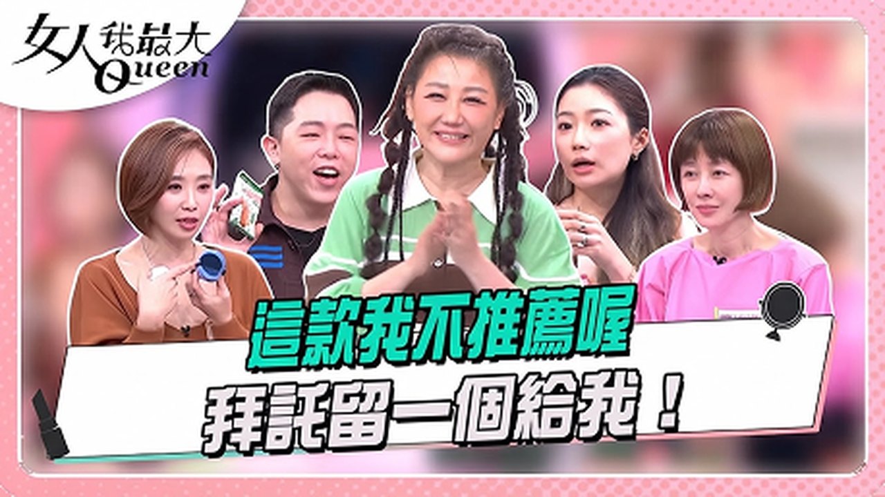
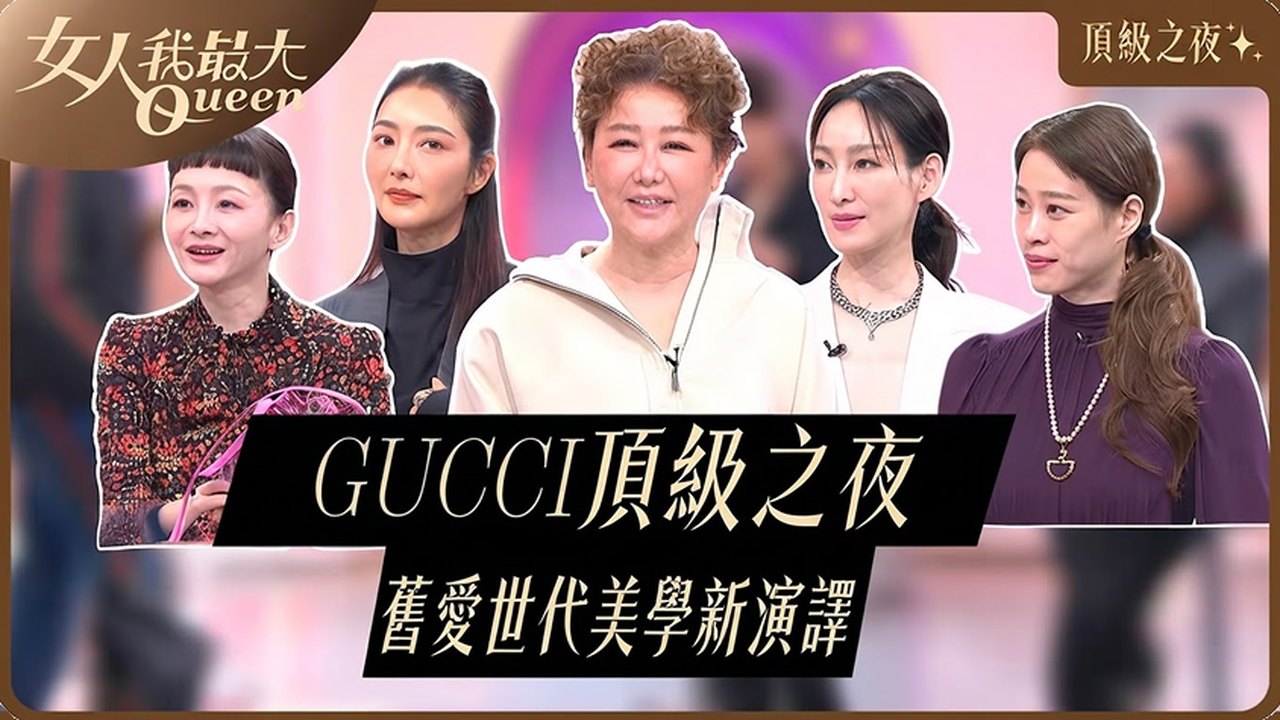
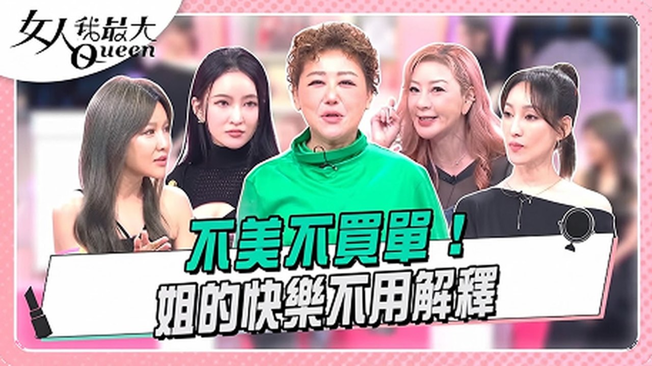
Building Queen’s digital business depended on three departments. Each was doing its job well, but each held a different position on digital:
Program
Focused on the show, not digital.
Editorial
Protected the reading experience from disruptive ads.

Sales
Sold digital as a bonus in TV ad packages.
Each digital format had to serve the show, protect the reading experience, and give Sales something worth selling.
One designer. Shared engineers.
I was Queen’s sole product designer across web and app. Engineering was shared between two IPs, so I aligned PM, Editorial, Sales, and RD early to move work through a development queue I did not control.
I also redesigned the website homepage and mega menu, restructuring navigation around an SEO consultant’s recommended content structure to improve content discovery.
No design system. Products still had to ship.
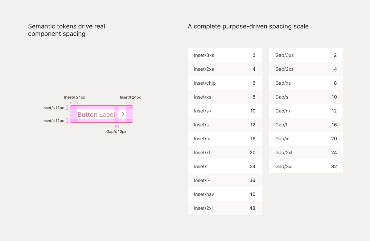
Every new product was being designed on top of the same missing foundation: no shared tokens, no reusable components, and no established way for design and engineering to make system-level decisions together. Continuing page by page would only create more inconsistency and technical debt.
I identified the gap, researched the approach, secured the PM’s support, and worked directly beside the RD lead to build the company’s first token architecture shared by design and engineering.
The first real test was Queen’s own pink. The old shade was hard to pair with anything else, so I replaced it with a new one, defined once as a token, and it rolled out across web and app together.
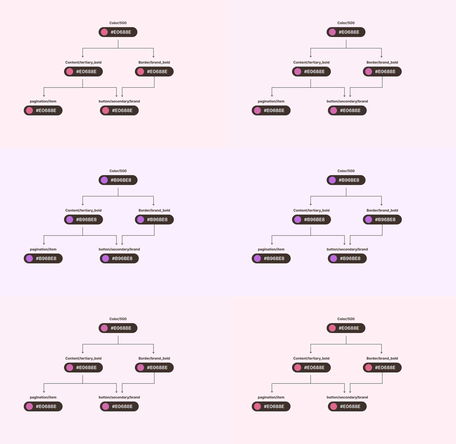
Later products could reuse the same decisions, ship with less back-and-forth, and stay visually consistent. The practice also spread beyond Queen as designers on other IP teams began building their own token systems.
01. AI Q&A
Every AI-written article ends with three more questions
Media outlets build AI Q&A for one reason: more pages mean more ad impressions. Queen wanted readers to keep exploring instead of leaving after a single article.
At the end of each fashion and beauty article, readers see three AI-generated questions about the topic. Tapping one opens a new AI-written article that answers it, with more questions of its own at the bottom.
Unlike the vendor most Taiwanese outlets license, which answers only from the article on screen, our system draws on a full year of fashion or beauty articles. I designed the experience around it.
It worked, once readers found it
We tracked readers from Mar 26 to Jun 9, 2026.
Original article
2.0%
Question click-through on the original article · only 41.3% of readers scrolled far enough to see the questions
AI-written article
13.8%
Question click-through on the AI-written article, among readers who saw the questions
Readers mistook it for an ad
Queen’s chief editor suspected readers mistook the AI block for an ad: it sat between ad banners and related reads. A UX researcher’s tests with AI personas pointed the same way.
Moving the block higher wasn’t an option: ad slots and related reads held the space above it. So I focused on what I could change, and redesigned the entry point to read as content, not advertising.
Before
After
What changed
- 1More breathing room. 32px 60px between the ad and the AI block, so it no longer reads as part of the ad slot.
- 2Typing reveal. The heading types out and the questions arrive one by one, like a reply in a conversation.
- 3A clear arrow. Each question now signals it leads somewhere.
Daily views of AI-written articles rose from under 900 to over 1,350. Six days before the redesign, the AI PM had changed how the AI writes the questions, so each one asked something specific the article could answer. The two worked as a pair: one made the block easier to notice, the other made the questions worth tapping.
Beauty questions drew more clicks than fashion questions inside AI-written articles: 16.9% vs 10.6%. That gap informed the next iteration, which added cover images to support visual browsing.
02. Ad Magic
A riddle worth stopping for
One of our front-end engineers suggested borrowing the riddles printed on drink cups at Taiwanese breakfast shops. I designed the experience: a pink riddle pill above the ad, so readers pass the ad on the way to the answer. Together we picked 20 riddles for the test.
We placed it in the first and third ad slots and ran a 15-day A/B test across 480K users. Half saw the ads as usual; half saw a riddle above them.
Ad clicks dipped. Total yield rose.
Readers did stop. The riddle’s click-through rate was nearly three times the ad’s: 0.63% compared with 0.23%.
Ad click-through fell from 0.26% to 0.23%, which on its own would look like a failed test. But readers in the riddle variant saw more ads along the way, and total yield per million users rose 9% compared with the control.
The tradeoff: readers could enjoy the riddle without paying attention to the ad. My proposed next step was to tie the answer to the ad itself, so the reveal would lead readers into the sponsored message.
03. Cover Story & Prestige
Templates editors could publish and Sales could sell
Cover Story is Queen’s cover feature: a story about the celebrity on the cover, followed by a set of articles. A separate curation team built every issue as a one-off page, so each one took about two months to go live.
Because the design system was already in place, I could turn the page into a reusable CMS template. Editors now publish each issue themselves, and every issue comes with a sponsorship slot Sales can sell.
2 months 2 weeks
Time to publish each issue
NT$800–900K
From one dedicated sponsorship deal
The same approach carried over to Prestige, Queen’s luxury segment on TV. I designed Prestige’s digital identity and a page template for editor-curated TV highlights, giving Sales a TV + digital sponsorship package. TOD’S signed on as the first buyer.
04. App
Giving the app a reason to open
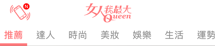
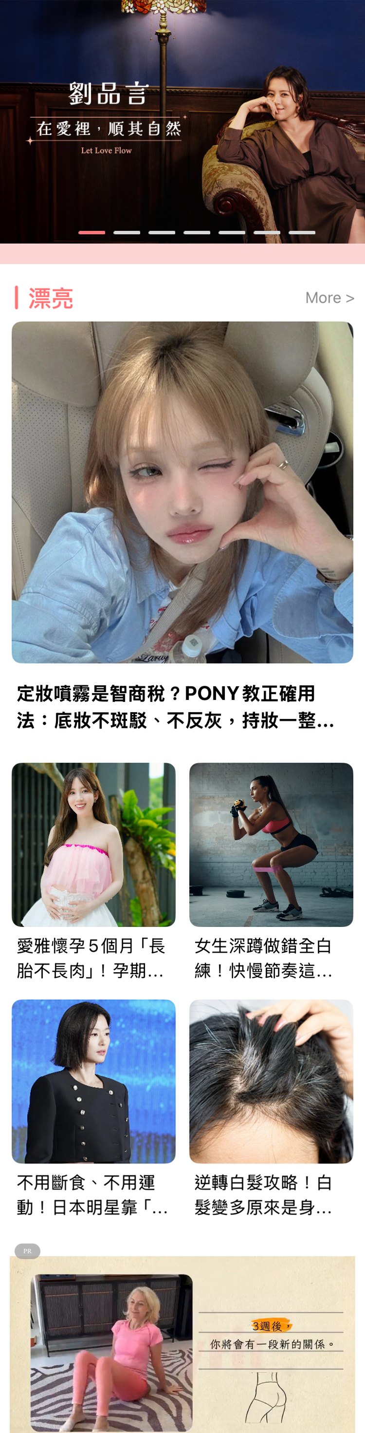
Queen’s app ran on giveaways: read-and-win and shake-to-win drew readers in, but gave them little reason to stay. Our user insights team found a gap: Queen is a TV brand, yet only 17% of app users had watched a show video, even though app reviews pointed to that connection to the show. The show’s tab sat second to last, off the first screen. I redesigned the homepage to bring the show forward.
Before

After
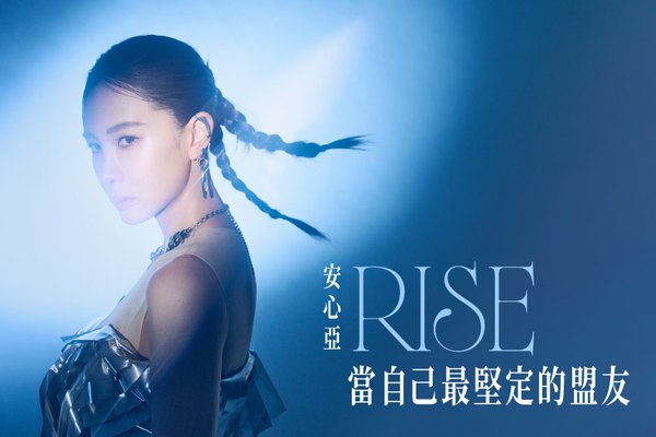
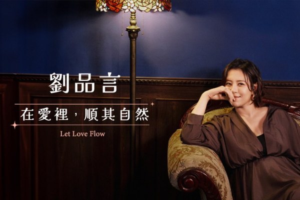
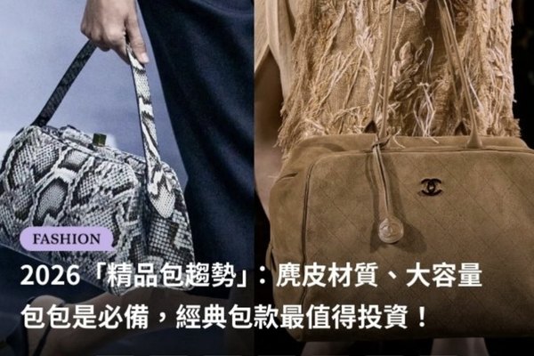
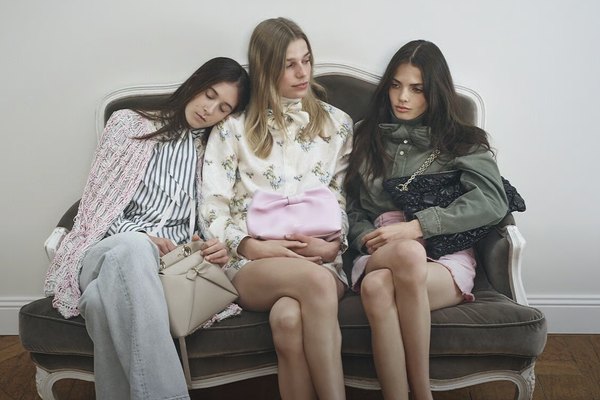
誰是真正的Dior達人?5題小測驗來驗挑戰你的時尚品味
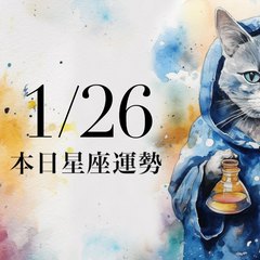
【2026/1/26 每日星座運勢】雙魚配戴銀飾有好運,天秤財運有好收穫
了解更多
唐綺陽一週星座運勢 : (1/26-2/1) 水瓶善用手邊資源運用人脈
了解更多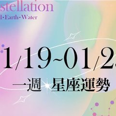
一週生肖運勢 (1/26-2/1)
了解更多

What changed
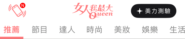
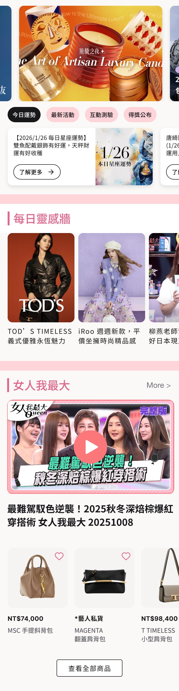
- 1The show moves up. Its tab moves up to second in the navigation, its section sits higher on the homepage, and each episode gets a button to shop its products.
- 2A smaller hero banner. Three banners fit on one screen, so Cover Story, Prestige, featured articles, and the quiz all get seen as it rotates.
- 3A fixed row for giveaways. Horoscopes, draws, quizzes, and winners stay in one place, so returning users always know where to find them.
- 4A daily feed. Fresh styling and beauty picks every day, mixing brand partnerships, show exclusives, and episode highlights.
The app needed a service of its own, one that could drive both revenue and retention. I designed a quiz flow that works for both editorial and sponsored content, with the brand, questions, and prize swappable for each campaign. In a quiz sponsored by L’Occitane, every perfect score earned a draw entry with no limit on replays, and a screenshot of the result unlocked a gift with a booking at the brand’s spa.